Jake
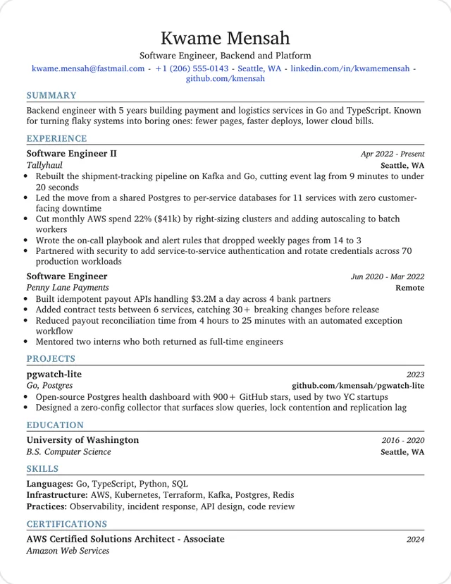
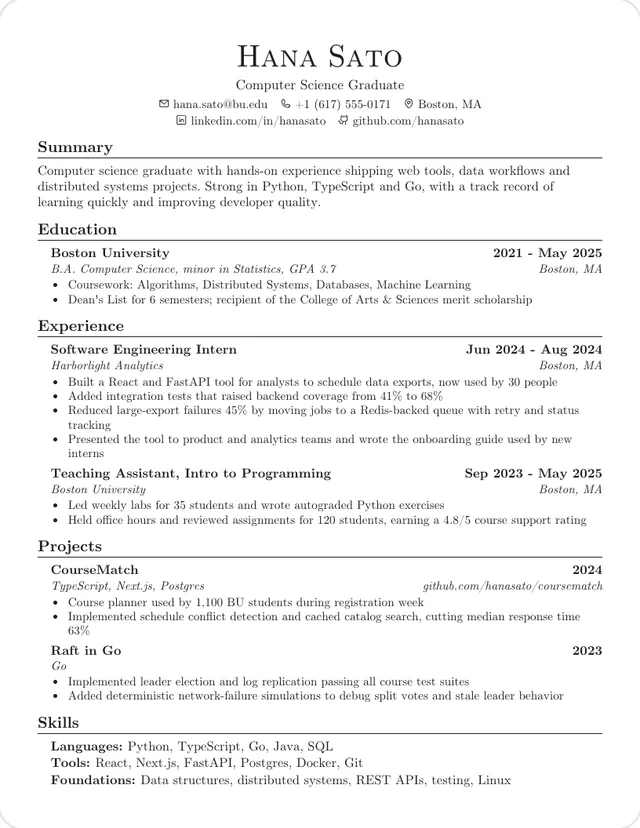
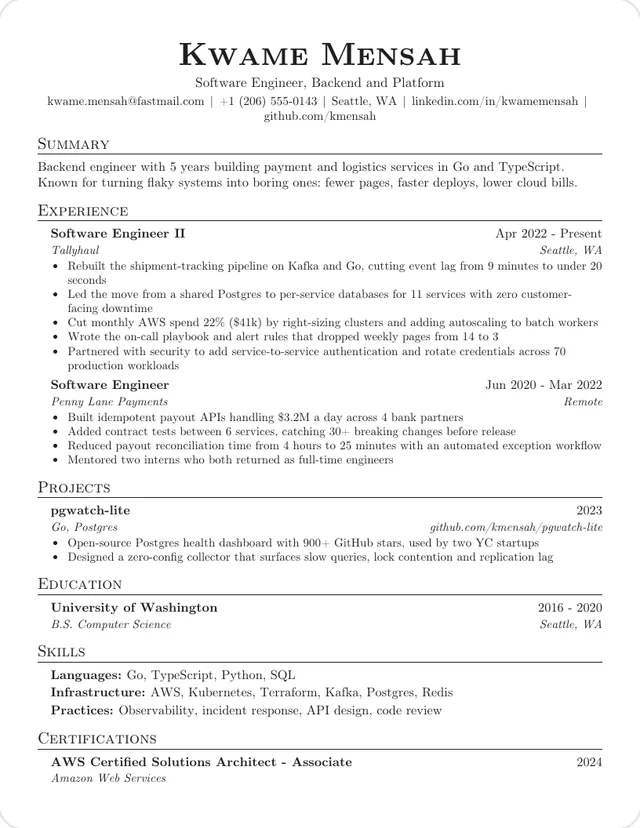
One column, Computer Modern
The reference layout: small-caps headings, one contact line, and dates on the same row as each job.
Use this template: JakeThese 16 templates passed our check: one column, no photo, and a PDF whose text reads back in the right order, with your name first and every heading intact. The other 10 failed at least one rule, and this page says which and why.
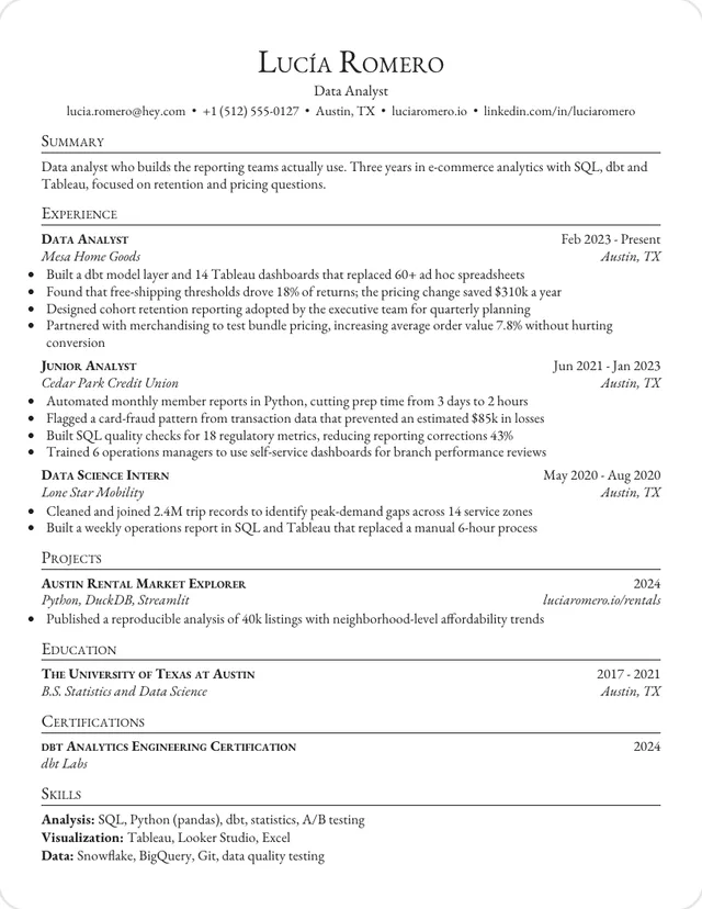
The safest choice. Contact details are plain text with a simple separator, which is what our ATS formatting guide recommends.
One column, Computer Modern
The reference layout: small-caps headings, one contact line, and dates on the same row as each job.
Use this template: JakeOne column, Times
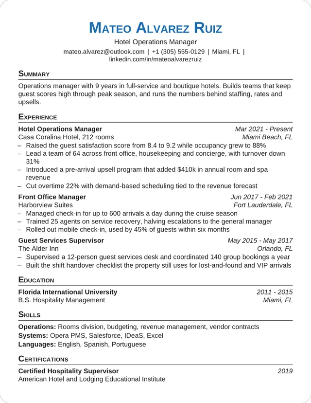
Entries have no bullet markers, so there's nothing to turn into a stray character. Dates end each role line.
Use this template: MinimalOne column, Garamond
Jake's top-to-bottom order in Garamond, for a softer look with the same clean text.
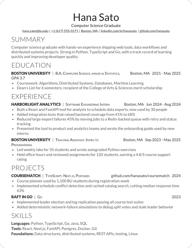
Use this template: GaramondOne column, Lato
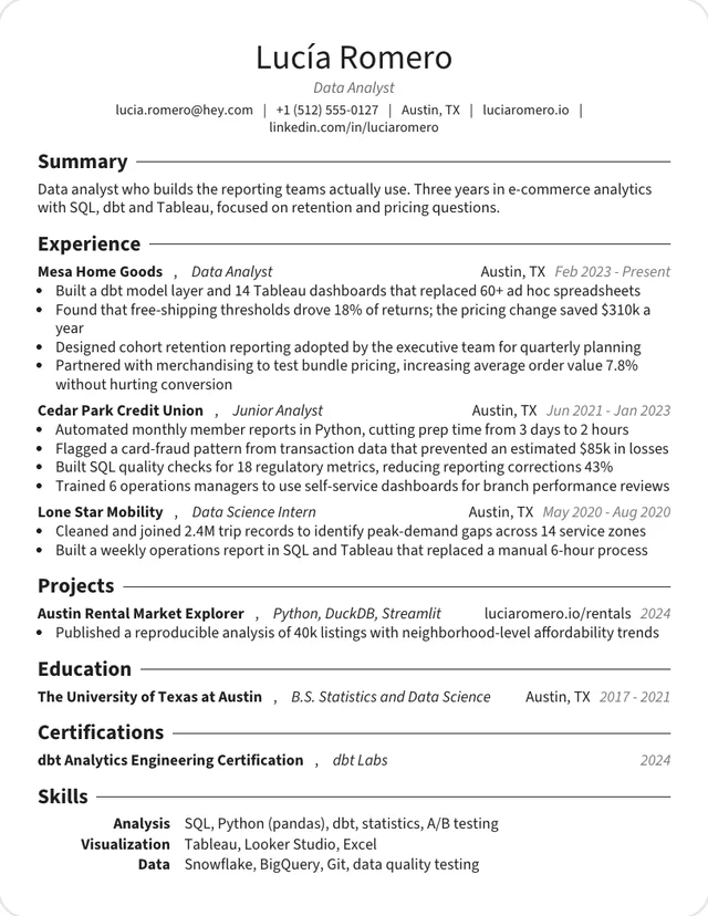
No rules or boxes at all. Each role sits on one line with its employer, place and dates.
Use this template: Modern DeedyOne column, Computer Modern
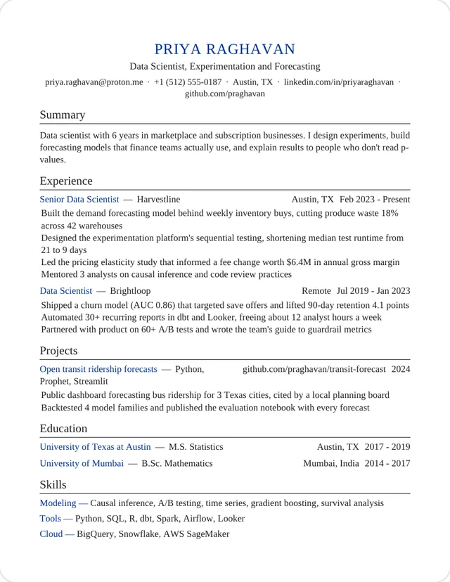
Adds a job title under your name and a justified summary. Both read back exactly in order.
Use this template: Tech EngineerOne column, Charter
Steel-blue capital headings in Charter. The color is only paint: the text underneath reads the same.
Use this template: ProfessionalOne column, Helvetica
Helvetica with dash bullets, which stayed ordinary dashes in the PDF text.
Use this template: OrestOne column, Source Sans
Fits the most on a page. Its skills table still reads label first, then list.
Use this template: GenericOne column, Helvetica
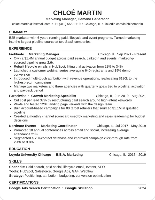
Bold capital headings and one line per role, in the plain style university career offices use.
Use this template: CampusOne column, Lato
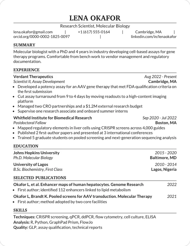
Plain ruled sections with room for publications, for science and research applications.
Use this template: BiotechThese passed the same check. The icons are drawn as graphics, so they add no stray characters to the text. If you want no doubt at all, use a template from the group above.
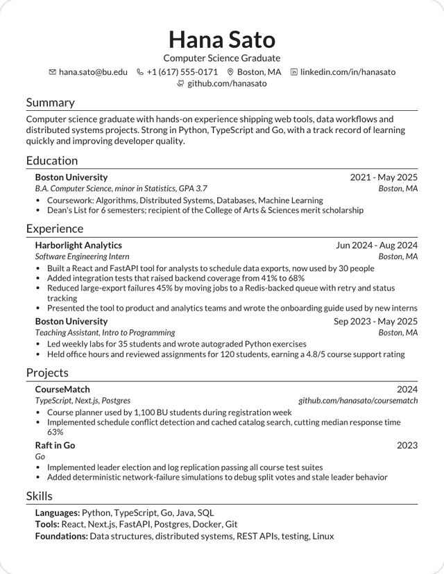
One column, Lato
Jake's structure in Lato, with the company leading each role.
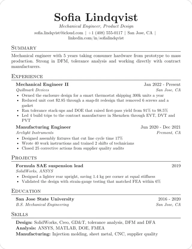
Use this template: SWEOne column, Computer Modern
Two centered contact lines and bold sentence-case headings in Computer Modern.
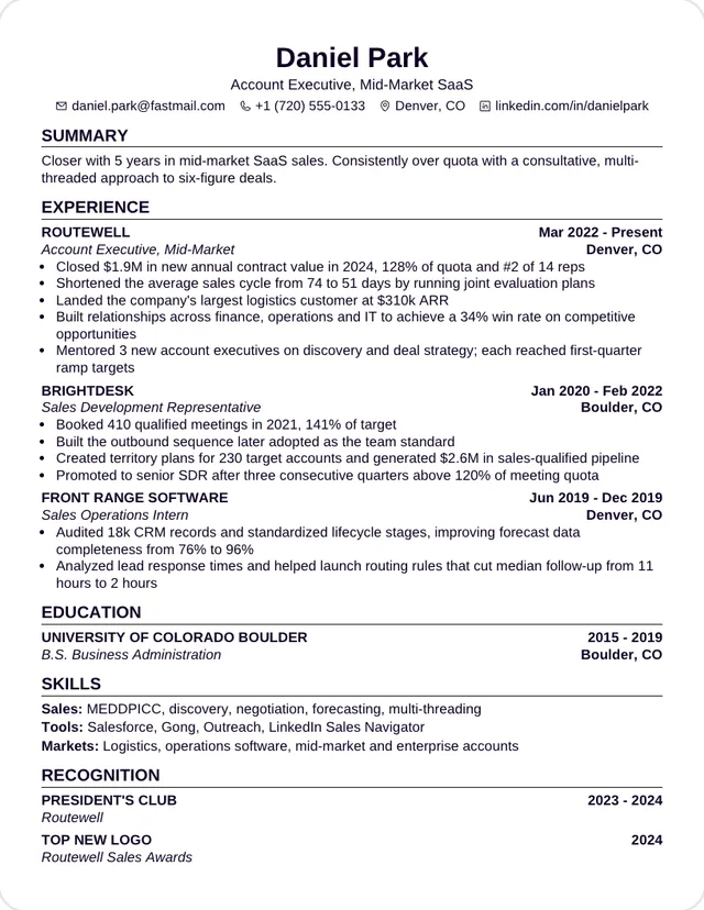
Use this template: JVOne column, Helvetica
A dense business-school layout with employers in capitals and bold dates.
Use this template: GraduateOne column, Source Sans
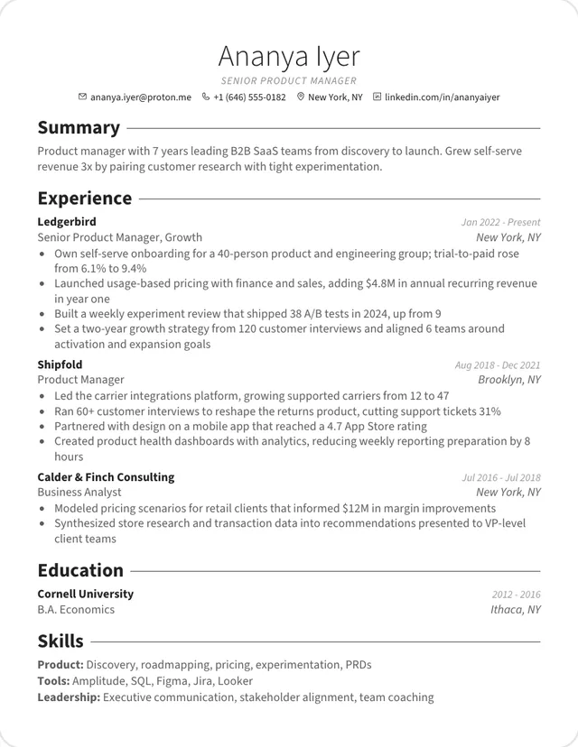
A light centered name, grey body text and bold headings that run into a rule.
Use this template: RusselOne column, Inter
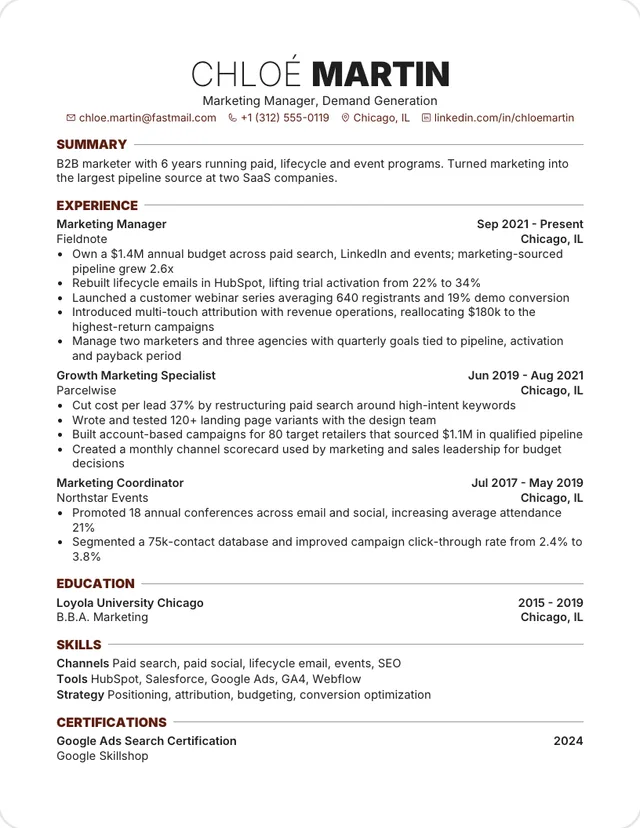
A thin and black capital name with sepia headings and wide margins.
Use this template: RoverOne column, Source Sans
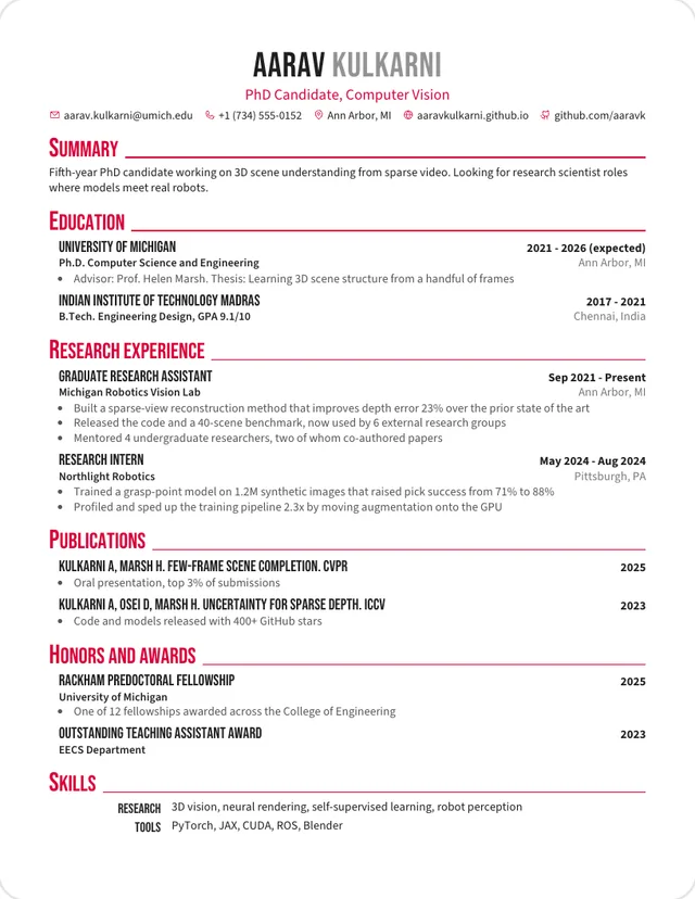
Condensed capitals and crimson headings. Strongest for research CVs.
Use this template: CrimsonWe exported each template's sample resume to PDF through the same print path the app uses, then read the text back with PyMuPDF, an open-source PDF library. A template had to meet every rule here:
This tests the file, not any one vendor. We didn't run these through commercial applicant tracking systems, and no template can promise how every system will read a file. We checked each template with its own sample on November 4, 2026, so a very long email address or job title of yours can still wrap differently.
| Template | What we found |
|---|---|
| Insider | Two columns and a photo. |
| Deedy Columns | Two columns. Narrow columns wrap more lines, which can split a date or a job title. |
| Charles | A photo. Its text read back cleanly, but US and UK employers don't expect a photo. |
| Data Science | Contact details read back before your name, and the sample's email address wrapped mid-word. |
| Entry Level | Contact details read back before your name. |
| Kyvernetes | Your first and last names read back on separate lines, and contact details sit in a grid. |
| Developer | Dates read back before the role they belong to, and contact details sit in a grid. |
| Institute | Education is a table, and its cells break apart in the text. |
| Elegant Spaced | Letter-spaced capitals read back as "S U M M A R Y", so a parser may not see the heading. |
| Elegant | A decorative star between contact details lands in the text. |
Leaving a template out doesn't mean no system can read it. Most of these still produce readable text, and they're fine when you're sending the file straight to a person.
A clean file only gets your details into the right fields. Recruiters then search those fields, so your words matter as much as your layout. Compare your resume with the posting using the keyword scanner, and run the ATS resume checker before you apply. Common ATS myths explains what these systems actually do.
You can test any finished resume yourself. Copy all the text from the PDF and paste it into a plain text editor. Your name, contact details, headings, job titles and dates should appear in a sensible order.
Each design is modeled on a CV template shared on Overleaf and rebuilt in HTML. The sample text is our own.